Our vision science approach to readability is to evaluate just how typography affects legibility. There have been more than a few claims of more readable fonts in the design world, but little hard research in this area. Our approach has been different. Rather than comparing performance on specific fonts or font names, we use (and have pioneered, actually, the use of) parametrically defined fonts in studying how specific typographic variables affect readability so that empirical results can be applied as broadly as possible. This has allowed us to study the impact of specific typographic variables independently of one another and of extraneous typographic and stylistic variables.
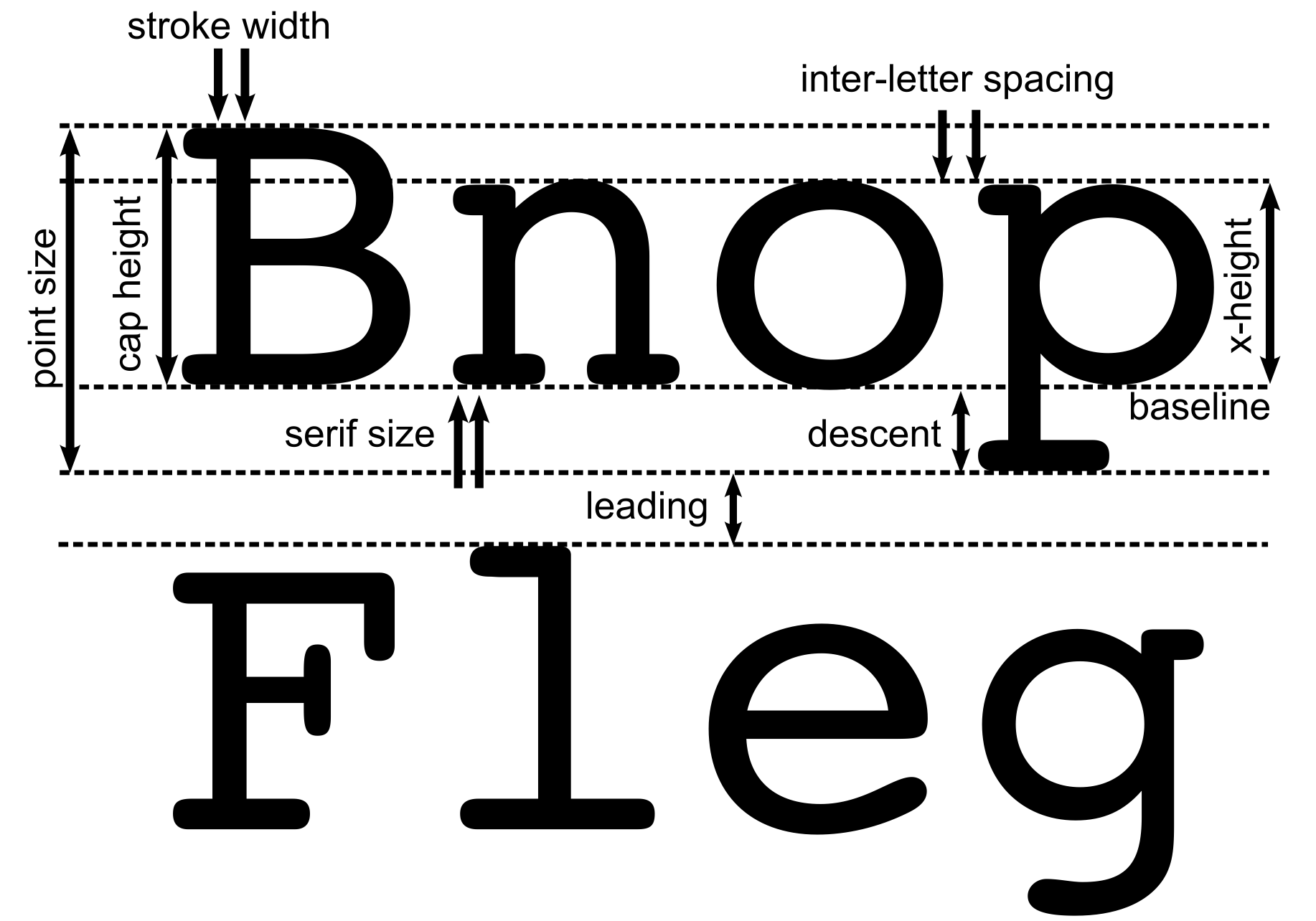
Among the variables we have studied are stroke width (boldness), inter-letter spacing [1,2,3,4,5], fixed vs. proportional spacing, letter case (upper vs. lower vs. mixed), serif vs. sans-serif, letter aspect ratio, and outline vs. filled letter glyphs. We even developed a prototype parametric font design program and with it tested the idea that users with low vision could produce fonts tailored to their own best performance in real-time (Arditi, 2004). More recently we authored an entry on reading typography in the Sage Encyclopedia of Perception edited by E. Bruce Goldstein.
